There are around 1000 different Google Fonts that can be used for free. This is an incredible number of options. In order to integrate the ideal font into your own website, this selection does not make it easy for the user. We have therefore compiled a list of the best Google Fonts here.
We also explain how best to use Google Fonts in a WordPress website.
In addition to the aesthetic decision when choosing the font, there are other criteria that must be taken into account. The typography of the website can have a decisive influence on the bounce rate and the conversion rate.
Another crucial point is the reading flow of the users of your website. If this is negatively influenced, this has far-reaching consequences.
It pays to invest time in choosing the right Google font when creating a website. Choosing the first font is not a good decision.
The 10 best Google fonts in 2019 – based on general user behavior
According to an investigation by Google Fonts Analytics, the general user behavior was determined. With around 25 trillion fonts views, Google has enough data in hand to analyze meaningful results.
Are you ready to learn more? Perfect.
So let’s take a look at the most popular fonts and look at the newcomers for 2020, who have become more and more popular in 2019.
Roboto
-serif
Types: 12
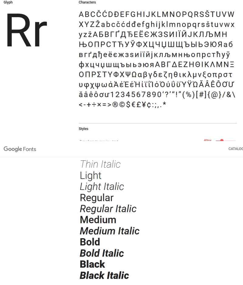
Roboto is a Sans-serif font by Christian Robertson that was developed by Google for the Android operating system. In the meantime, it is extremely popular, available in different versions and is therefore classified several times in Google Fonts Analytics. That means: Robotoitself is the most popular font, Roboto Condensed as a variant is also extremely popular and is ranked sixth, Roboto Slab in 13th!
Open Sans
Sans-serif
Types: 10
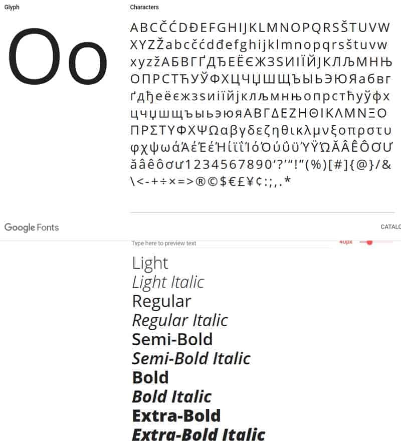
Open Sans is also a Sans-serif font developed by Steve Matteson. Google nutzt Open Sans auf etlichen seiner Webseiten, in seinen gedruckten Anzeigen und für online-Werbung.
Lato
Sans-serif
Types: 10
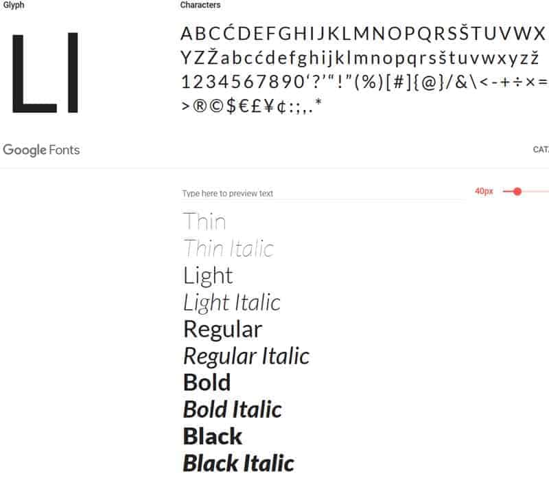
Lato is also a very popular sans-serif font by Lukasz Dziedzic.
Slabo 27px/13px
Serif
Types: 2
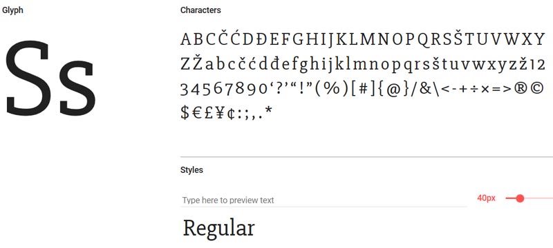
Slabo Serif Font was developed by John Hudson of Tiro Typeworks. This font was specially developed for a certain size. Either 27px or 13px, depending on the needs of the users.
Oswald
Sans-serif
Types: 6
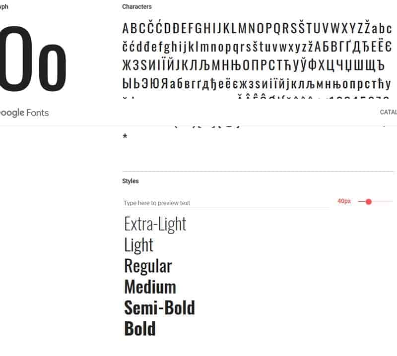
Oswald is a sans-serif font developed by Vernon Adams.
Source Sans Pro
Sans-serif
Types: 12
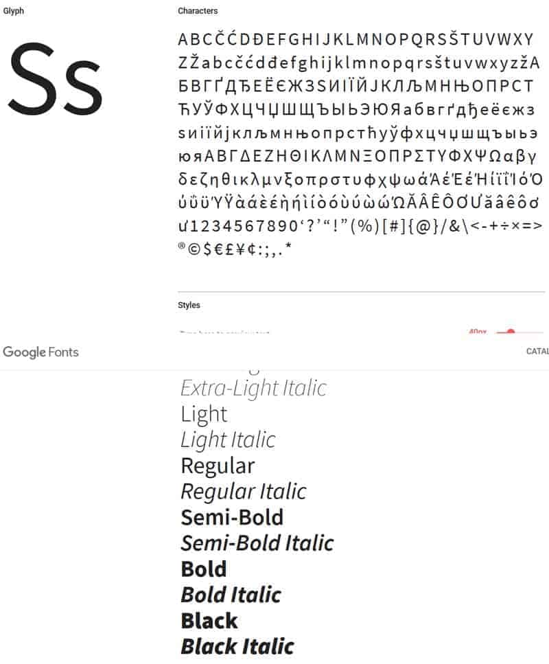
Source Sans Pro is a Sans-serif font by Paul Hunt. The font was developed for Adobe and was the first open source font.
Montserrat
Sans-serif
Types: 18
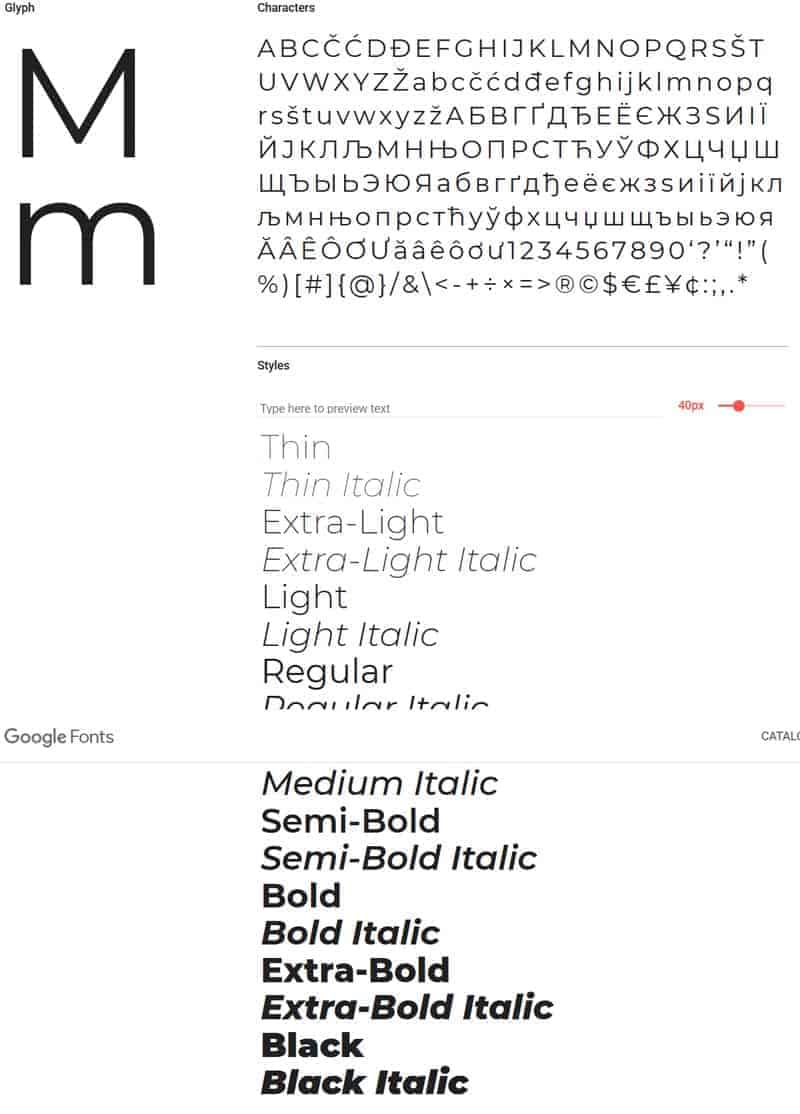
Montserrat is a sans-serif font by Julieta Ulanovsky. The font has 18 different styles.
Raleway
Sans-serif
Types: 18
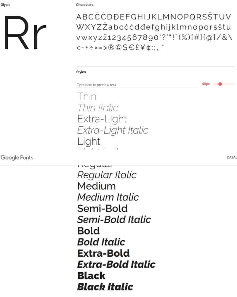
With its 18 different fonts, Raleway offers a particularly large selection. The font was developed by Matt Mclnerney. There is also a dotted subspecies called Raleway Dots, which is often used for headings.
PT Sans
Sans-serif
Types: 4
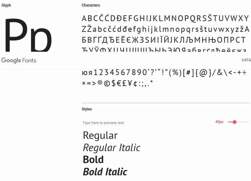
The PT Sans font was developed for official publications of the Russian Federation. It includes both Latin and Cyrillic letters. There are several variants available as well as “Serif” options.
Lora
Serif
Types: 4
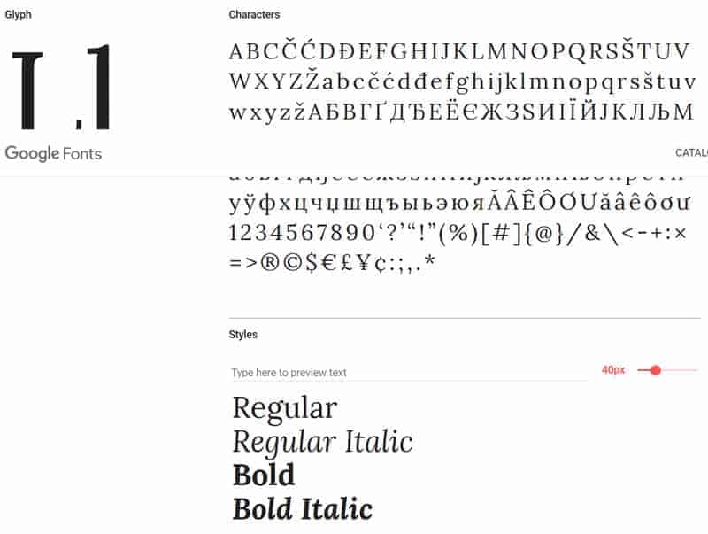
Lora is a popular serif font. It is often used for web design as well as for print design.
Additional fonts and popular fonts in 2019/2020
The ten fonts presented above are (in order) the most popular fonts from Google. But there are also the big climbers of 2019 and 2020. They are not yet well known and are therefore not yet so present in the analytics numbers.
So here are our favorites from the newcomers:
Noto Sans / Serif
Sans-serif oder serif
Types: 4
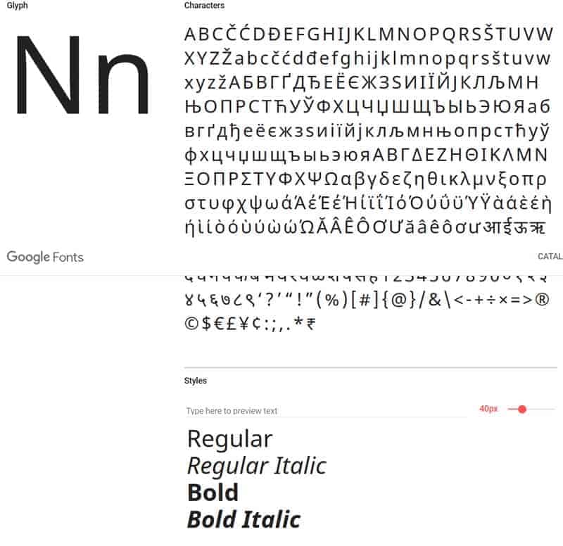
The Font Noto was commissioned by Google. The font is available in serif and also in the sans serif variant. New updates appear at certain intervals. There are now more than 100 Noto fonts.
Nunito Sans
Sans-serif
Styles: 14
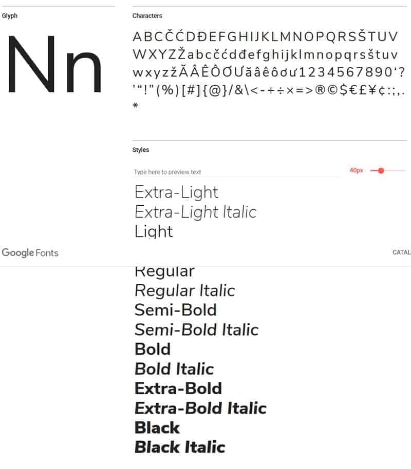
Nunito Sans is a sans-serif option that is becoming increasingly popular (its use has tripled since 2019).
Concert One
Sans-serif
Types: 1
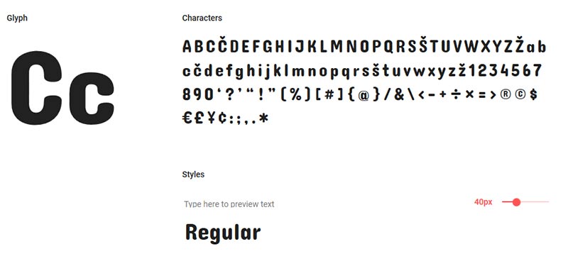
Concert One is a rounded sans serif font. It is particularly suitable for headings.
Prompt
Sans-serif
Types: 18
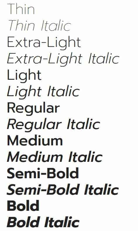
Promt is a sans-serif font by Cadson Demak from Thailand.
Work Sans
Sans-serif
Types: 9
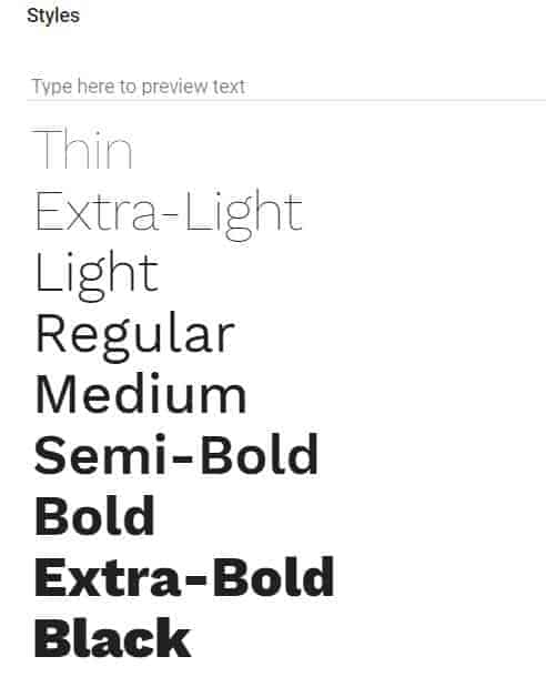
Work Sans is a sans serif font that is optimized for display on monitors and for use on the Internet.
How different Google Fonts are combined.
So you have now found the right Google Font? Then we congratulate. Now another big task is waiting for you. Now it’s about combining the Google Font with other fonts on your website.
As you read on, we’ll explain what options you have to find the best combination of your fonts.
Popular combinations are suggested on the Google Fonts website. You have probably already seen this when you called up the links to the individual fonts on Google.
https://joewp.com/wp-content/uploads/2019/12/google-font-kombinationen-1.jpg
But there are also other portals where you can get suggestions for font combinations, e.g. on the Font Pair website.
Best combinations for using Google Fonts with WordPress
We give you some tips for using Google Fonts in WordPress.
Limit the number of font sizes
A number of the fonts listed above such as Montserrat or Raleway are available in 18 different font sizes. This is perfect if you are looking for a large selection. So that the loading time of the WordPress website does not get out of hand and the website becomes too slow, you should limit yourself to the absolutely necessary fonts and only use them. This is a very important point so that the performance of your website does not deteriorate.
We recommend not using more than two sizes for most fonts:
– Regular
– Bold
You can define this yourself via the “Customize” tab at Google Fonts, if you want to use your own fonts and do not want to use the fonts preset in the respective WordPress theme.
If you use a professional WordPress theme (such as: Avada or Divi), you can set which Google Fonts and which sizes should be used.
Another option is to use “variable fonts” which are very popular at the moment. They are supported by all modern browsers. These are fonts that only need a font file. However, there is not yet a large selection of them.
Host Google Fonts local on your server
If you do not want to download Google Fonts from the Google server, you can also host them locally on your server. In most cases, this also leads to better performance of your website. In addition, most Google Fonts are already cached in the users’ browsers.
With your own fonts (no Google fonts) you should definitely consider loading these fonts via your own CDN.
Use fonts that are regularly updated
The same security principle applies to fonts as to WordPress plugins and themes. The developers are constantly releasing updates and improvements. This is the case with most of the fonts presented here.
Pay attention to the legibility of the fonts used
By adhering to the relevant guidelines, your content will be accessible to people with disabilities, blindness, poor eyesight, deafness, learning difficulties, cognitive impairments, restricted freedom of movement, speech impairments, sensitivity to light or combinations of the aforementioned restrictions. According to the World Health Organization, there are approximately 260 million people with visual impairments. 40 million people are blind and 220 million people have moderate to very severe visual impairment.
Another very important setting is the color contrast. The best content on your website is of no use if users have difficulty reading the Internet and find it a burden. You will then leave your website and you will definitely not come back.
Incidentally, the Google search engine rates the above criteria as decisive ranking factors and your own position in the search results is therefore dependent on compliance with these guidelines.
There are various ways to test your website for compliance with these criteria. We test the websites we created using Incognito mode in the Chrome browser using the “Lighthouse” tool. Here the results under the points “Accessibility” and “Best Practices” should be adhered to. If optimizations are suggested in the test, they should be carried out on the website. After that, you can be sure that Google will rate the website positively. By the way, we also offer these optimizations with our performance module for websites not created by us.

